Supervising Art Director: Drew Monahan
Set Decorator: Claudia Bonfe
Graphic Designer on the Atlanta reshoots of Ghostbusters: Frozen Empire; a Sony production. I helped recreate the established sets and created new graphics for added locations, props, product packaging, picture cars, etc.
Production Designer: Paul Austerberry
Supervising Art Director: Rory Bruen
Graphic Designer on The Color Purple: The Musical, a Warner Brothers production. I created period specific graphics for sets and locations, props, product packaging, picture cars, etc.
Production Designer: Rika Nakanishi
Art Director: Lauren Coghlan
Graphic Designer on NAOMI Season 1, a Warner Brothers production. I created graphics for sets and locations, props, logos, magazines, advertisements, product packaging, picture cars, etc.
Production Designer: Christopher Glass
Set Decorator: Kathy Orlando
Set Dec Graphic Designer for Ms. Marvel, a Marvel Episodic. Designed “fan made” merch for the AVENGERCON booths.
Production Designer: Toby Corbett
Art Director: Cedar Valentine
Graphic Designer on Dynasty Season 4, a CBS production. I created graphics for sets and locations, props, logos, magazines, advertisements, product packaging, picture cars, etc.
Production Designer: Greg Berry; Christopher Glass
Art Director: Troy Sizemore; Audra Avery; Arte Contreras
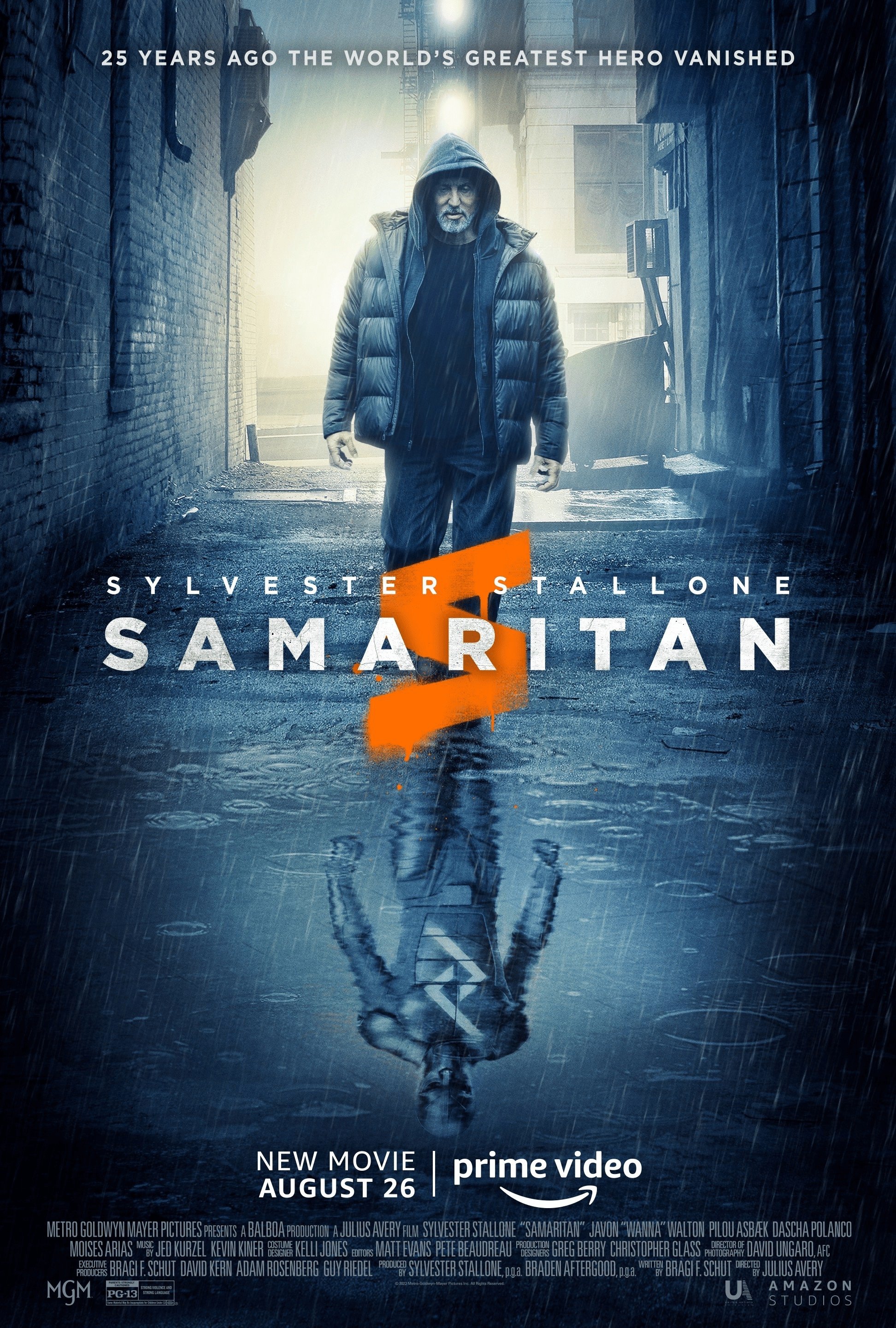
Graphic Designer on SAMARITAN, a MGM feature. I created graphics for character logos, sets and locations, props, newspapers, magazines, advertisements, product packaging, picture cars, etc.
Production Designer: Garreth Stover
Art Director: Cedar Valentine; Billy Duncan
Graphic Designer on Dynasty Season 3, a CBS production. I created graphics for sets and locations, props, logos, magazines, advertisements, product packaging, picture cars, etc.
Production Designer: Seth Reed
Art Director: Ellen King
Graphic Designer on the pilot, Cipher, a NBCUniversal production. I created graphics for sets and locations, props, logos, magazines, advertisements, product packaging, picture cars, etc.
Production Designer: Oliver Scholl
Supervising Art Director: Troy Sizemore
Worked as the Assistant Graphic Designer on the Sony production of Venom. Helped create graphics for various sets and locations, props, product packaging, logos, magazines, newspapers, advertisements, picture cars, etc.
Problem: Vision Realty & Management wanted to freshen up their marketing materials with a new look and updated content.
Solution: Created a new look for various print and digital marketing materials ranging from business cards and brochures, to yard signs and exterior signage to new websites.
NASCAR CROSS PROMOTION:
Problem: Great Clips needed a campaign for a cross promotion between Great Clips, Atlanta Motor Speed Way, and Quick trip.
Solution: We created a campaign directed at the manly man. We kept it clean, simple and to the point. The main graphic of the tire tread is bold and represents power and freedom reminding the customer of hard work and the smell of asphalt on a hot day. We wanted the campaign to be direct and strong. We used the catchy headline, masculine graphic, and bold color palette to drive the promotion across all POP and digital components of the campaign.
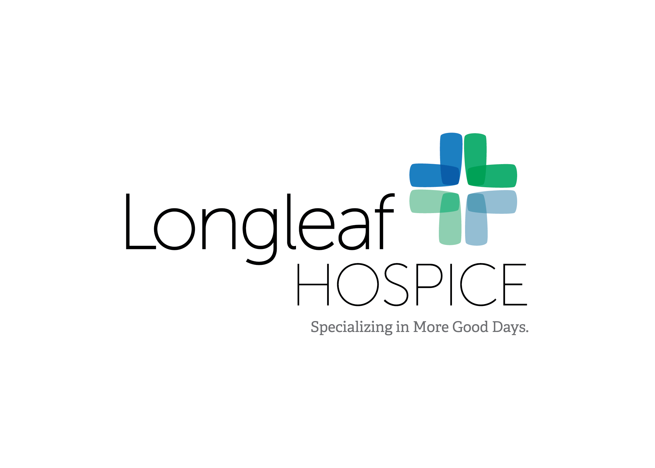
Problem: Longleaf Hospice wanted to update their outdated logo to reflect their values of strength, dignity, and the personalized care they give each of their patients.
Solution: A sleek sans serif paired with a slab serif and bold logo mark gives the new logo a modern aesthetic Longleaf Hospice wanted. I played off the trusted medical cross for the logo mark and utilized layered “petals” to symbolize the various levels of unique care Longleaf Hospice gives each patient. The “petals” slope inward to visually represent the focused attention each patient receives. The logo is strong but delicate. Steadfast but compassionate. Trustworthy. Clean and memorable.
Problem: B&D Burgers had no set brand standards or identity. B&D Burgers wanted to elevate their brand to reflect the high-quality, fresh food they served.
Solution: We started by creating & implementing new brand standards to be utilized across all branded and marketing materials: logos, typography, voice/messaging, color schemes and photography. We wanted the brand to feel fresh, playful and modern while maintaining the fun, family-friendly atmosphere B&D Burgers is known for. Simple, Bold, Playful, Fresh.
OFFICER APPRECIATION PROMOTION:
Problem: Great Clips needed a promotional POP campaign for an officer appreciation event.
Solution: Our "Cop Top" concept utilized famous, pop culture police officers' identifying hair styles to promote Great Clips' Officer Appreciation Day. We created stylized vector art of each cop's unique hair style and composed them on a simplified, mugshot-esq layout. 2017 Silver Southeast ADDY recipient in POP design.
Problem: Spanx branding is kitchy and doesn’t reflect the high-end undergarments they produce. I was tasked with creating a brand identity and campaign that embodies the luxury line.
Solution: The female body is a beautiful, powerful thing- and sometimes, women need a little help harnessing that power. I created a campaign that helps empower women to believe in themselves and to be comfortable in their own skin. For those times they need a little support, Spanx is there. I utilized the nude female form in black and white, dark backgrounds, wrapped text to highlight the smooth curves of each unique female body. I wanted women to embrace their bodies, feel confident in themselves, and remember that Spanx will always be there to give them a little support.
Problem: Meow Mix gets lost among the many cat food brands. I was tasked with helping Meow Mix stand out against its many competitors.
Solution: Animal people are weird. We obsess over our pets in ways that only other animal people understand. We create voices for them, dress them up and take 1,000 pictures of them- each one being more adorable than the next. They are our children- precious fur covered babies. I created a print campaign that taps into the slightly obsessive, kind of weird way people talk and act towards their pets. I used hand lettering out of cat food to add personality and character to each headline. I wanted the copy and visuals to be as unique as the love we feel for our pets.